Year: 2026
Client: Dragan Stojanovski
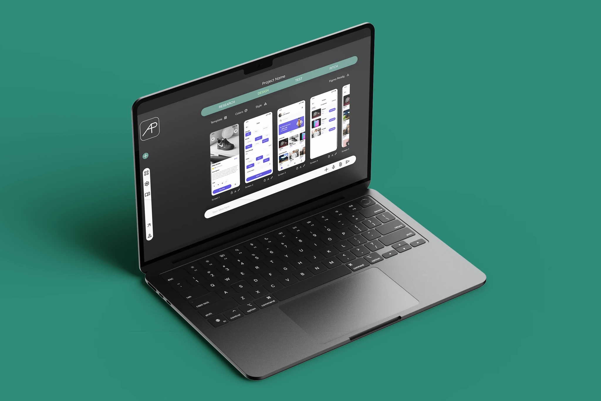
Check out the Prototype (opens in a new tab)
Most people with a startup idea never find out if it’s any good. They don’t know how to test it, and the tools that could help are built for developers and researchers. Approbo is an AI platform that wants to change that by taking an MVP idea through real-user testing and market feedback until it’s validated. In 2025 I took on the interface design as a solo project for the client, Dragan Stojanovski. He had already done thorough market research, so I started from there and spent my first days learning every feature of the platform and how it mapped onto Design Thinking. What I discovered early on was that validating an idea is messy and rarely goes in a straight line, so the interface had to bend with the user instead of forcing them down a fixed path.
#MVP Validation #Live Prototype #Google AI Studio #Firebase #AI-Assisted Development #Chat Interface #Product Design
The brief was to design the user interface for Approbo. The platform’s target users were entrepreneurs, startups, IT enthusiasts and UX/UI researchers, but I widened that group to include everyday people who have ideas and no technical background. To understand how all of them think, I mapped out customer journeys to spot pain points, interviewed non-technical people with ideas, and turned what I learned into personas and journey maps that guided the design.
I wanted to take Approbo from first idea to a live, working prototype myself instead of stopping at Figma screens, so I could own the research, the design system, the interaction logic and the deployment. The product walks founders through four design thinking phases (Research, Design, Test and Pitch) in a conversational interface, where the AI asks one question at a time and the answers fill a results panel next to the chat.
I started with the product vision, a site map and a DESIGN.md that fixed the visual identity: a dark olive theme, a mint accent, Quicksand, pill-shaped components and a slim icon-only side rail. I generated the screens in Google Stitch, then moved into Google AI Studio, which worked as the coding agent for the front end in vanilla HTML, CSS and JavaScript. The back end runs on Firebase, using Auth, Firestore and AI Logic, with Gemini 2.5 Flash as the AI, and the app is deployed on Google Cloud Run. I used Claude throughout as a design advisor and technical partner, and Microsoft Clarity for behavior tracking and early user testing.