Year: 2025
Client: Teatar Komedija
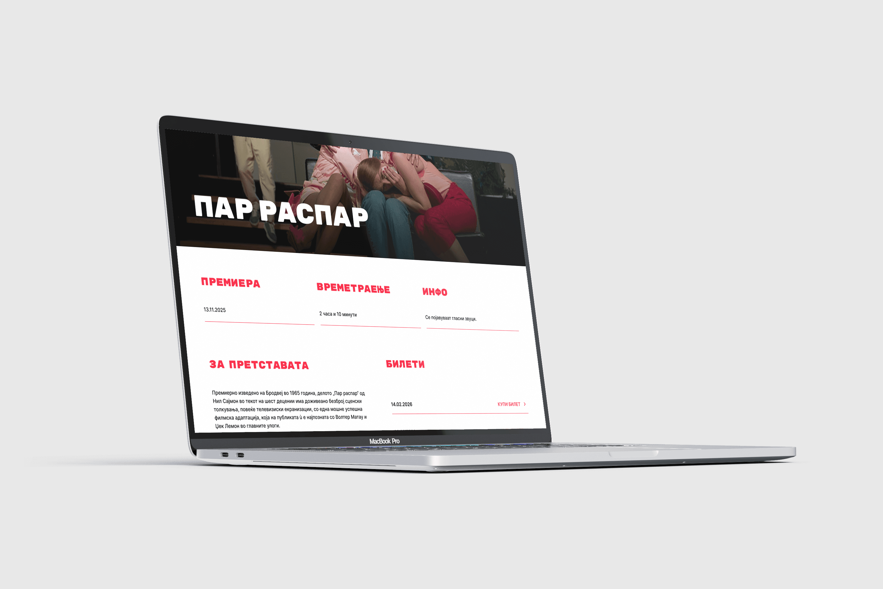
Teatar Komedija had a problem most theatres would envy: its shows sold out within hours. But behind that success, the same small crowd kept getting the seats, older visitors struggled to buy tickets at all, and the website said almost nothing about the theatre or the actors who made it special. I joined a team of five designers to change that. We set out to make buying a ticket feel simple, open the theatre up to a wider audience, and let its story finally come through on screen. I began by listening, through research and stakeholder interviews, and as the project grew I found myself stepping up to lead the team, guiding our discussions and helping us turn what we’d learned into design decisions.
#Redesign #Stakeholder Interviews #Sitemap #User Flows #Discoverability #Research-Driven Design #Design Leadership
The brief asked us to make buying tickets easier, reach a wider audience, and give the theatre’s mission and its actors more room on the site. My part covered the research and stakeholder interviews, reworking the information architecture and sitemap, and redesigning the ticketing flow. I also ran our design discussions and made sure decisions actually got made.